I want to talk about two cheap and relatively simple changes you can add to your CSS to make gradients look much better: easing linear gradients and colour spaces.
Use easing
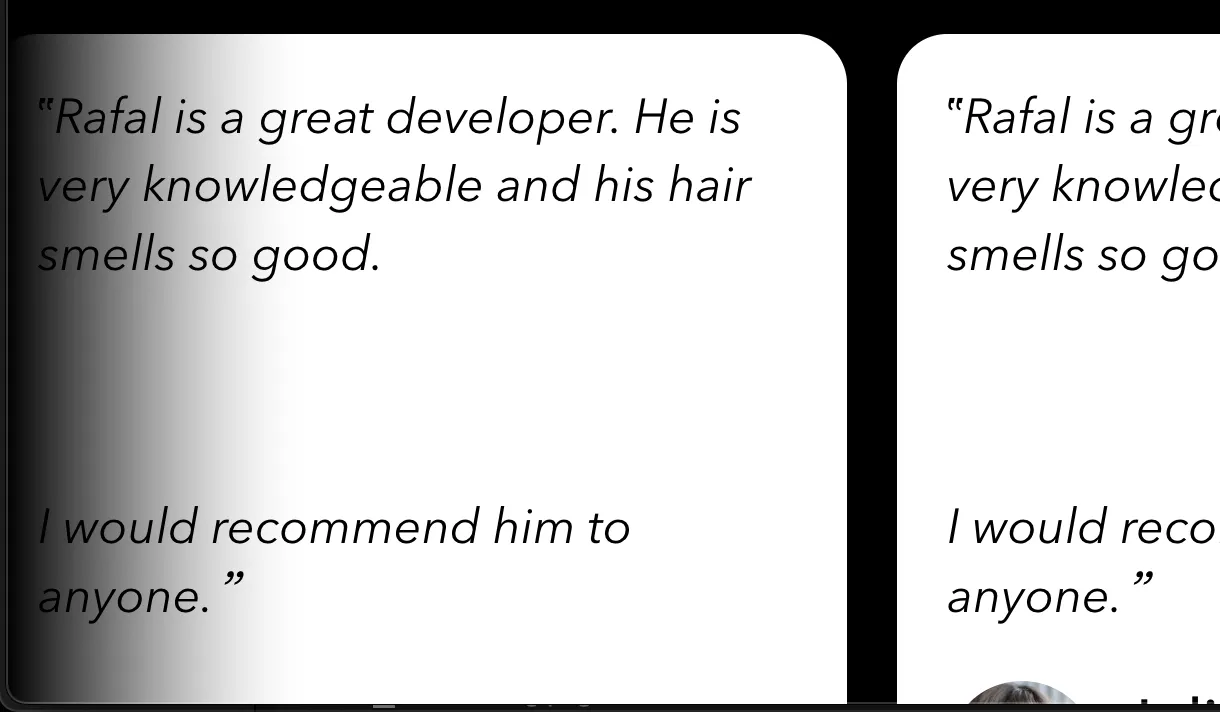
Let's start with a real-world problem. Last week I was working on my new and shiny Consulting Page. I wanted to add a slider similar to the one one the site of Gabriel Valdivia, but more aligned with the style of my own site (example here):
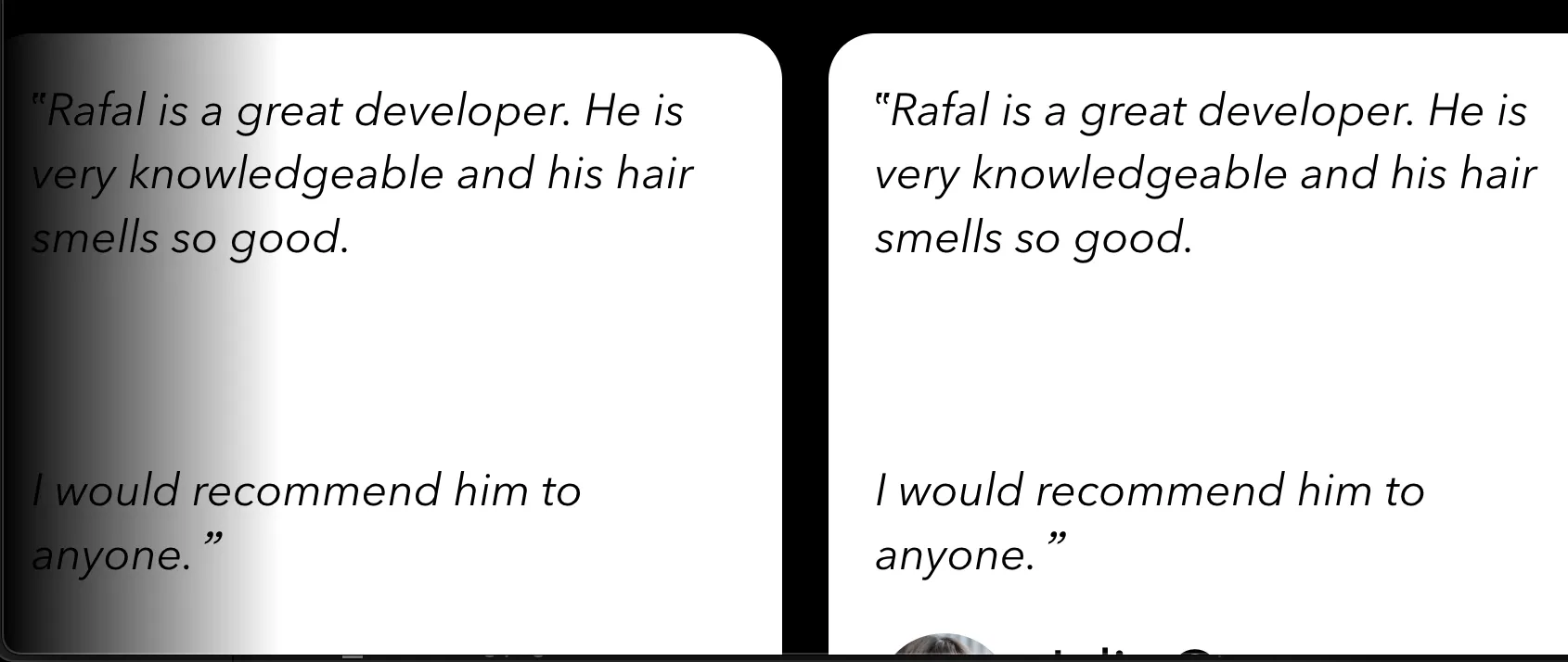
What bugs me about this screenshot is that the gradient cuts off sharply, it doesn't blend with the element behind it.
The effect is more obvious when you compare these two gradients:
Note how B more blends with the background more naturally.
The solution here was to ease the transition between colours by specifying more stops:
--gradient: linear-gradient(
	to right,
	hsl(var(--bg-h), var(--bg-s), var(--bg-l)) 0%,
	hsla(var(--bg-h), var(--bg-s), var(--bg-l), 0.738) 19%,
	hsla(var(--bg-h), var(--bg-s), var(--bg-l), 0.541) 34%,
	hsla(var(--bg-h), var(--bg-s), var(--bg-l), 0.382) 47%,
	hsla(var(--bg-h), var(--bg-s), var(--bg-l), 0.278) 56.5%,
	hsla(var(--bg-h), var(--bg-s), var(--bg-l), 0.194) 65%,
	hsla(var(--bg-h), var(--bg-s), var(--bg-l), 0.126) 73%,
	hsla(var(--bg-h), var(--bg-s), var(--bg-l), 0.075) 80.2%,
	hsla(var(--bg-h), var(--bg-s), var(--bg-l), 0.042) 86.1%,
	hsla(var(--bg-h), var(--bg-s), var(--bg-l), 0.021) 91%,
	hsla(var(--bg-h), var(--bg-s), var(--bg-l), 0.008) 95.2%,
	hsla(var(--bg-h), var(--bg-s), var(--bg-l), 0.002) 98.2%,
	hsla(var(--bg-h), var(--bg-s), var(--bg-l), 0) 100%
);
This is ridiculously verbose and of course I didn't generate these stops manually! I used this tool by Andreas Larsen.
Here's the result:
Narrator: Smooth, sophisticated, mysterious - nothing says "I'm looking for a job" better than a perfectly eased gradient.
Colour spaces:
Another thing you could should do to achieve more natural colour transitions is to specify the colour space for your gradient. Here's the same transition in rgb and oklch:
Here's a really good description of why you should use oklch.
Notice how nicely oklch with multiple steps blends with the background of this page.
See this demo for more examples.
Summary
Now, now. I'm not suggesting that you should drop everything and start updating your CSS right this minute. But, if you're starting a new project, or are looking for a small piece of work because your brain is mush, give it a go.
PS. Do you remember when CSS gradient generators were a thing? Seems they're still a thing.
References:
- useRainbow() · Rafał Pastuszak- a (very rudimentary) intro to colour theory in CSS, plus perceptually-uniform colour spaces
- Color Spaces for More Interesting Gradients | CSS-Tricks - CSS-Tricks
- Non-Boring Gradients - A non linear CSS gradient generator
- Easing Gradients
- OKLCH in CSS: why we moved from RGB and HSL—Martian Chronicles, Evil Martians’ team blog
- OKLCH Color Picker & Converter
- CSS
 Did you enjoy reading this article? Consider